online since 2009
Donut Chart for Fundraising
A circular ring chart that fills as donations come in. The donut style is on our roadmap — in the meantime, our circular gauge charts embed on any website today with one snippet.
Donut chart style coming soon.
We're building a dedicated ring/donut chart that fills arc-by-arc as your campaign progresses.
Let us know this is a priority →
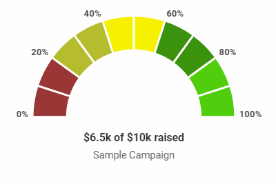
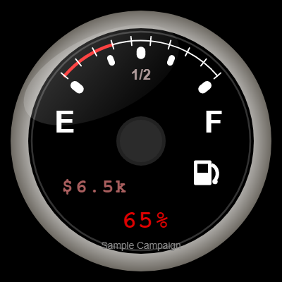
Circular gauge charts — available now
While the donut style is in development, these circular gauges work today. Pro styles, $49/year.
Gauge
segmented arc, half-circle speedometer
Chrome Dial
circular dial, chrome bezel
When to use a donut or ring chart
Ring charts combine circular symmetry with clear percentage readability.
Impact reports
Show what percentage of a goal has been funded in annual reports or donor impact pages — the donut format reads cleanly at small sizes.
Sidebar widgets
Square and circular charts fit naturally in sidebar widgets where a tall thermometer would be awkward.
Mobile-first pages
A circular chart resizes gracefully on mobile — equally readable at 200px or 600px wide.
Social media graphics
Square-format charts export and share naturally on Instagram, Facebook, and LinkedIn without cropping.
How a donut chart fundraiser works
1
Enter your goal
Set your campaign title, goal amount, and current amount raised. The chart computes the fill percentage automatically.
2
Choose the donut style
Once available, select the ring or donut style from the style picker. Pro license required.
3
Embed anywhere
Copy the
<img> snippet and paste it into any page — WordPress, Squarespace, Wix, or raw HTML.Frequently asked questions
What is a fundraising donut chart?
A donut chart (also called a ring chart) is a circular visualization where a ring fills progressively to show percentage completion. For fundraising, the ring fills as donations come in — 25% filled means 25% of the goal reached. It's a modern, compact alternative to a thermometer that reads well at any size.
How does a donut chart compare to a thermometer?
Both show progress toward a goal, but thermometers are vertical and donut charts are circular. Thermometers are the traditional choice for fundraising campaigns; donut charts feel more contemporary and suit pages where a square or circular format fits better — sidebars, mobile-first layouts, and report pages. For classic "fundraising thermometer" recognition, thermometer styles are more familiar to donors.
When will the donut chart style be available?
The dedicated ring/donut chart style is on the roadmap. In the meantime, the Gauge (style 16) and Chrome Dial (style 17) are circular formats available today for Pro users. Let us know if the donut chart is a priority and we'll factor that into scheduling.
Can I embed a donut chart in an email?
Yes — all thermometerchart.net charts embed as plain
<img> tags, which work in HTML emails wherever image display is enabled. This is true of the gauge charts available today and will be equally true of the donut chart when it launches.Start with a circular gauge chart today
Donut chart coming soon. Gauge and dial styles available now — Pro from $49/year.
Create a chart →